Mysidia Adoptables Support Forum  

Home Community Mys-Script Creative Off-Topic
Go Back   Mysidia Adoptables Support Forum > Off Topic Discussions > Other Chat

Notices

View Poll Results: Which One?
A 1 25.00%
B 3 75.00%
Voters: 4. You may not vote on this poll

Closed Thread
 
Thread Tools Display Modes
  #1  
Old 04-08-2013, 01:58 PM
Tequila's Avatar
Tequila Tequila is offline
The Grim One
 
Join Date: Jan 2009
Location: Souther Tier, New York State
Posts: 1,356
Gender: Female
Credits: 109,681
Tequila is on a distinguished road
Default Need Opinions Please (card design)

I've been working on a tarot deck for a few years now, so this project has a lot of background information to build on.

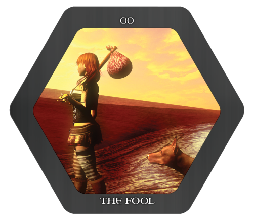
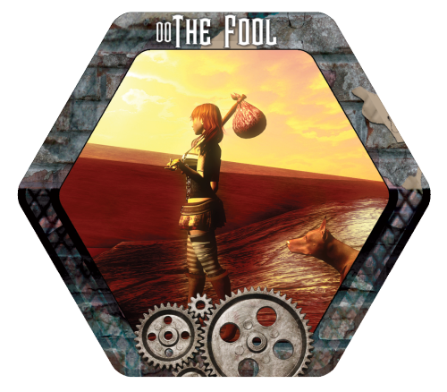
The deck will be steampunk themed, and printed on hex cards (six sided, this will be fun to do reading with...).

Here are two versions of the card design, which do you like better?
Option A

Option B

Please vote and feel free to comment on the design!
__________________
Artist. Designer. Gamer. Mother.
[portfolio] [tarot] [Rune Hollow] [freebies]
  #2  
Old 04-08-2013, 02:23 PM
AlexC's Avatar
AlexC AlexC is offline
Moderator
 
Join Date: Dec 2009
Location: Canada
Posts: 753
Gender: Unknown/Other
Credits: 78,005
AlexC is an unknown quantity at this point
Default

Wow, those both look great - and they'd be work.

Personally I like the top one, because I think on a six sided thing, you'll have a ton of text and images already, not to mention any other ones you'd be holding, so keeping the image clutter down would improve how reading and such. The grey stripe would also look nicer on a die or whatever you're printing it on, vs having an image on a plain base. (this point is mute if you aren't sticking it on a base.)
__________________
  #3  
Old 04-08-2013, 02:44 PM
Tequila's Avatar
Tequila Tequila is offline
The Grim One
 
Join Date: Jan 2009
Location: Souther Tier, New York State
Posts: 1,356
Gender: Female
Credits: 109,681
Tequila is on a distinguished road
Default

Quote:
Originally Posted by Gloometh View Post
Wow, those both look great - and they'd be work.

Personally I like the top one, because I think on a six sided thing, you'll have a ton of text and images already, not to mention any other ones you'd be holding, so keeping the image clutter down would improve how reading and such. The grey stripe would also look nicer on a die or whatever you're printing it on, vs having an image on a plain base. (this point is mute if you aren't sticking it on a base.)
They'd be like normal tarot cards (although I may add in astrological stuff from my Mandala Astrological tarot book/cards) just six sided.

The mandala set I own has four sided square cards:

I want to make mine similar in theory, but different in design.
__________________
Artist. Designer. Gamer. Mother.
[portfolio] [tarot] [Rune Hollow] [freebies]
  #4  
Old 04-08-2013, 02:45 PM
AlexC's Avatar
AlexC AlexC is offline
Moderator
 
Join Date: Dec 2009
Location: Canada
Posts: 753
Gender: Unknown/Other
Credits: 78,005
AlexC is an unknown quantity at this point
Default

I'm still a little confused by what you mean by six sided - six sided like dice, or like six images on each card?
__________________
  #5  
Old 04-08-2013, 03:00 PM
Tequila's Avatar
Tequila Tequila is offline
The Grim One
 
Join Date: Jan 2009
Location: Souther Tier, New York State
Posts: 1,356
Gender: Female
Credits: 109,681
Tequila is on a distinguished road
Default

Quote:
Originally Posted by Gloometh View Post
I'm still a little confused by what you mean by six sided - six sided like dice, or like six images on each card?
like pictured, the card will have six sides instead of four (like your standard card). ;3

Full project is actually being posted bit by bit on tumblr at http://tarot.tequilaCorbly.me
__________________
Artist. Designer. Gamer. Mother.
[portfolio] [tarot] [Rune Hollow] [freebies]
  #6  
Old 04-08-2013, 03:26 PM
AlexC's Avatar
AlexC AlexC is offline
Moderator
 
Join Date: Dec 2009
Location: Canada
Posts: 753
Gender: Unknown/Other
Credits: 78,005
AlexC is an unknown quantity at this point
Default

Oooohh, damn, I'm slow today. xD Okay, nevermind.

I'd still go with A, though maybe I'd change it to a slightly different shade of grey, but that's just me.
__________________
  #7  
Old 05-02-2013, 08:14 PM
Tequila's Avatar
Tequila Tequila is offline
The Grim One
 
Join Date: Jan 2009
Location: Souther Tier, New York State
Posts: 1,356
Gender: Female
Credits: 109,681
Tequila is on a distinguished road
Default

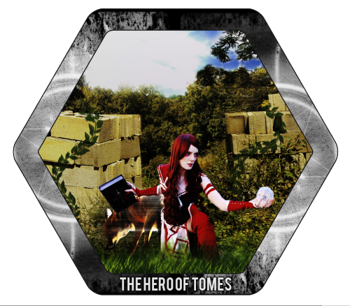
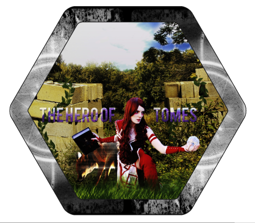
Update! No longer doing this as a Steampunk theme, please pick between these two designs now:
A:

B:

Project is located at http://tarot.tequilaCorbly.me for further information.
__________________
Artist. Designer. Gamer. Mother.
[portfolio] [tarot] [Rune Hollow] [freebies]
Closed Thread


Posting Rules
You may not post new threads
You may not post replies
You may not post attachments
You may not edit your posts

BB code is On
Smilies are On
[IMG] code is On
HTML code is Off

Forum Jump

Similar Threads
Thread Thread Starter Forum Replies Last Post
How to design a theme? CallumCharlton Questions and Supports 6 04-03-2015 12:44 PM
Name for my web design service? tahbikat Webmasters Area 7 04-05-2014 03:08 AM
Responsive design Kesstryl Suggestions and Feature Requests 5 03-06-2013 03:34 PM
Opinions Please Tequila Webmasters Area 10 12-13-2012 05:00 PM
What should I code next? Opinions Please! BMR777 Other Chat 29 07-14-2008 05:15 AM


All times are GMT -5. The time now is 02:46 PM.

Currently Active Users: 809 (0 members and 809 guests)
Threads: 4,081, Posts: 32,031, Members: 2,016
Welcome to our newest members, jolob.
BETA


What's New?

What's Hot?

What's Popular?


Powered by vBulletin® Version 3.8.11
Copyright ©2000 - 2024, vBulletin Solutions Inc.
vBCommerce I v2.0.0 Gold ©2010, PixelFX Studios
vBCredits I v2.0.0 Gold ©2010, PixelFX Studios
Emoticons by darkmoon3636