Quote:
Originally Posted by squiggler

Welcome! I'm not sure how to answer your question- maybe adding an image to the end of the line?- but one thing I think you might want to do is make the top links buttons instead of links; they all link to the homepage anyway, and hover-over drop down menus are unfriendly to touch-screen users.
Anyway, welcome, welcome! Hopefully you like it here.
|
Oh yes, I'm quite aware of the touch-screen issues! That's part of the reason I'm using Bootstrap. Once the page gets too small, it figures it's probably on a mobile device, and the layout automatically changes. I definitely want to try and make a mobile-first site, even though there's not a huge market for adoptables like that (there should be, why not!).
The links are currently 50px tall and as wide as the words are long. It makes for a pretty big pressing surface. But the drop downs are going to be hard to make like that, so each top link will probably have it's own page, so all parts of the site can be found, even if the drop down menu can't be used on small devices. It's always good to have more than one way to get to things.

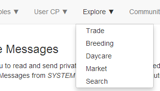
Ah, and I found a way to answer my own question, using css:
▼ This was the symbol I wanted to use. It's an html entity of
▼ but I had to convert it to something else to use it in css with the :after code. (I used
this site to find out it's css equivalent.)
HTML Code:
.ddmenu ul li a:after {content:'\25BC';}
.ddmenu ul li ul a:after {content:'';}
Produces the desired effect (the second line above makes it so the caret doesn't appear in the drop downs as well):
They're a little bigger than I wanted, so I'll probably scale down their size with css as well, ahaha?